
Note: This is the second part of a two-part series on readability in digital texts and literacy. The first post defines readability and why it matters. The second post elaborates on recent research done to better understand readability preferences, as well as opportunities to get involved.
By Shaun Wallace (Brown University), Dr. Benjamin Sawyer (UCF), Dr. Zoya Bylinskii (Adobe Research), and Rick Treitman (Adobe Inc.)
What’s in a font? A new study shows the reading speed gains possible by tuning typeface alone.
Information overload is a challenge of the modern era. Across work and leisure, modern readers face pressure to comprehend ever-increasing amounts of information. Nearly every adult reader would benefit from faster reading, provided they could retain comprehension. Towards this goal, and motivated by past work done by Readability Matters on tuning text, we wondered what reading gains might be possible if the formatting of digital text was customized. In this post, we present the results of an initial study with adult readers, where we explored the reading speed improvements possible by changing typeface alone. Is there an optimal typeface that works for all readers, or is it a matter of individual differences or personal preferences? Read on to find out.
Study design
We designed an online readability test that first determines a reader’s preferred font. Then the participant reads five short passages in five different fonts. We measured their reading speed (in words per minute) and comprehension scores by having readers answer some questions after every reading passage. Passages ranged in topic from nature, to science, to home improvement, and were aimed at a general, eight-grade level. Each passage was roughly 150 words and was split across two separate screens (participants had to click to keep reading).
Try out the full readability test for yourself
For our reading studies, we recruited 60 online participants (51% female), ranging in age from 18 to 55 (average age was 31). The study took 40 minutes to complete, including initial and post-completion surveys designed to learn a bit more about the readers and their reading habits.
Fonts compared
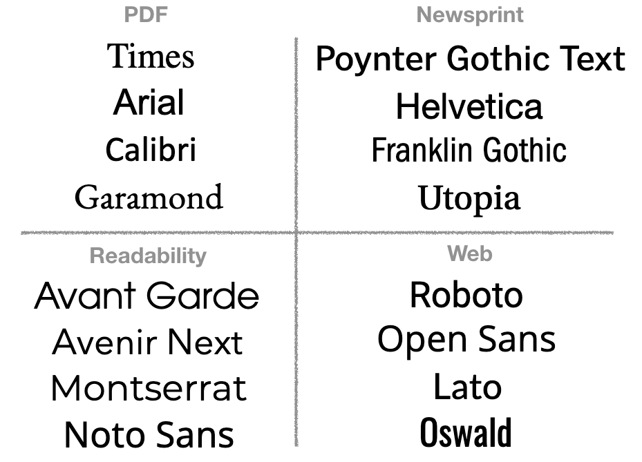 Every day, people are exposed to different fonts across mediums ranging from printed news to websites, and magazines to books. To cover these variations, we selected four fonts each from four different categories: fonts commonly used for PDF documents, fonts commonly found in printed newsprint, fonts recommended by Readability experts, and the most popular web fonts today. Pitting these fonts against each other in our study, we wanted to find out which fonts people tend to like, and which ones make for effective reading.
How do we find your most preferred font?
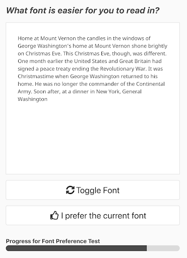 Inspired by eye exams and hearing aide adjustments, we designed an easy way to quickly narrow in on someone’s preferred font. Do you like this font, or this one better? By letting people click a button to toggle the font used for displaying text on the screen, we allowed them to compare pairs of fonts at a time. We used a double-elimination tournament so as not to test every pair of fonts exhaustively. Much like in a sports tournament, after a reasonable number of pairwise match-ups, a clear winner emerged. Try it yourself!
Which fonts do people prefer?
Across our 60 participants, the largest number of participants chose Noto Sans (9 participants), followed by Montserrat and Garamond (chosen by 8 participants each) as the winners of the font tournament described above. All the other fonts we tested (except Franklin Gothic) were also selected as a favorite by some of the participants. Interestingly, opinions on Garamond were split – those who liked it, liked it a lot (it was their top font); others disliked it, consistently voting it down. Surprisingly, familiarity with particular fonts had nothing to do with which fonts people liked.
What does all of this mean? Font preference varies greatly across individuals! But until the day we can automatically customize text font to the individual user, using Noto Sans seems like a safe bet. It was in the top 5 fonts for 80% of our study participants.
What were the most effective fonts for reading?
After the font tournament, participants in our study read five different short passages in five different fonts (one of which was their most preferred fonts). We used two metrics to measure the effectiveness of each font: reading speed and a comprehension score calculated after reading passages in a particular font. A font is only really effective if participants can read quickly in it, but still understand what they are reading. As a case in point, participants in our study tended to read quickly in Garamond and Oswald but did worse answering the comprehension questions afterward. However, both reading speed and comprehension were high for Noto Sans and Lato. Interestingly, we found that Roboto (the #1 web font in use today) performed poorly both in reading speed and comprehension, on average, across the participants in our study.
What drives reading speed?
Garamond and Oswald were the fastest to read in and also happened to be the smallest fonts in our study. Even though all fonts were presented at 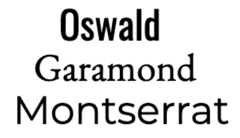 size 16, the perceived size can vary across fonts.
For example, size 16 for Garamond looks quite different from size 16 in a font like Montserrat (see inset on the left). Smaller fonts make it easier for someone to quickly read from left to right because more words fit on each line. In fact, some college-age participants mentioned preferring smaller fonts precisely because they can get through more words on a page. However, given that Noto Sans and Lato also had high reading speeds despite being pretty large fonts, this shows that size is not everything, and some individual differences appear here as well.
Another interesting observation was that the passages that were rated by our participants as more interesting also happened to be read slower on average. How about the opposite: could slowing people down when they read lead to increased interest in the reading material? That’s a question for a future study…
Do people know what is good for them?
Unfortunately, the fonts that people chose as their favorites in the font tournament were not their most effective fonts. Even worse, it was completely random (unpredictable) whether a favorite font would be the fastest or the slowest font someone read in, and whether it led to good or poor comprehension scores. Future text customization tools beware: you can’t rely on people telling you what font they like.
But it’s not all bad news. Since participants read in five different fonts, we could measure the speed gains possible by modifying font alone. It turns out that on average, people read 51% faster in their fastest font compared to their slowest font. This translates to a possible savings of 10 additional pages per hour, just from changing the font! Given these impressive gains and our finding that different fonts are effective for different people, we think there is an exciting future opportunity to build custom reading tools to augment reading performance for all readers.
In Closing…
We learned that we can’t rely on people to tell us which fonts they like as a way to determine which fonts will be most effective for reading. We also learned that people are incredibly different, both in what fonts they like and in what fonts they read most effectively. We were surprised to find the large reading gains possible by changing font alone. What we still don’t know is how to predict the optimal font for each person. For instance, how do age, reading experience, education level, etc., factor in? And while people don’t read fastest in their preferred font, maybe they would enjoy the reading experience more, leading to other measurable gains? Moreover, if font alone can lead to reading 51% faster, what additional gains may be possible by tuning character and line spacing, stroke width, and other Readability Features? These are all questions we’re excited to tackle next.
Read more about the full study.
Read Part I: Readability Features & Technology for Better Reading
A call to action: research study on font size personalization & reading efficiency
We are motivated by the mission to help all adult readers reach their full reading potential. In studying what makes different text formats effective, we would like to capture a wide representation of readers, from learners to advanced readers. We may find that some of our findings generalize across the population, or that different populations of readers benefit from a different set of formats. If you work with a group of adult readers that may want to participate in our studies, please get in touch! Let us engineer better reading for everyone.
Adobe and University of Central Florida are investigating the effect of font size on reading efficiency. We would like to determine if a particular font size setting can work for a majority of people, or if font size should be personalized to make an individual reader’s experience more efficient and more enjoyable. If you are interested in participating in this research, please complete this form. We will be in touch with further details including benefits and timeline. Please contact Ebony_Vandross@worlded.org if you have any questions.